You may have seen a Galton Board before. It’s a popular demonstration of how, even when a single event is chaotic and random, it’s possible to make precise statements about a large number of events. Specifically, the board illustrates the Normal distribution, also known as a Bell curve or a Gaussian distribution. This lesson will go back to the basics of the Central Limit Theorem, which explains why this distribution is so common.
We will use an overly simplified model of the Galton board to illustrate this. In this model, a ball has a 50-50 chance of bouncing to the left or right when it hits a peg. The ball’s final position is the sum of all of these random numbers. If we let many different balls fall, we can get a loose sense of how likely each bucket is. The basic idea of the central limit theorem is that if you increase the size of the sum of a random variable, for example the number of rows of pegs for a ball to bounce off, then the distribution that describes where that sum is going to fall looks more and more like a bell curve. This theorem has three assumptions that go into it, which will be revealed at the end of the video. To illustrate how general this theorem is, a couple of simulations will be run focused on the dice example. These simulations will take a distribution, such as a skewed one towards lower values, and take 10 distinct samples from it. The sum of the sample will then be recorded on a plot. This process will be repeated many times to show the theorem’s general applicability. Always with the sum of size 10, but keep track of where those sums ended up to give us a sense of the distribution. In fact, let me rescale the y direction to give us room to run an even larger number of samples, and I’ll let it go all the way up to a couple thousand. As it does, you’ll notice that the shape that starts to emerge looks like a bell curve. Maybe if you squint your eyes you can see it skews a tiny bit to the left, but it’s neat that something so symmetric emerged from a starting point that was so asymmetric.
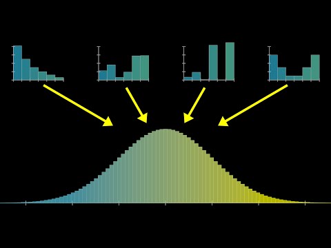
To better illustrate what the central limit theorem is all about, let me run four of these simulations in parallel. On the upper left I’m doing it where we’re only adding two dice at a time, on the upper right we’re doing it where we’re adding five dice at a time, the lower left is the one that we just saw, adding 10 dice at a time and then we’ll do another one with a bigger sum, 15 at a time. Notice how on the upper left when we’re just adding two dice, the resulting distribution doesn’t really look like a bell curve, it looks a lot more reminiscent of the one we started with - skewed towards the left. But as we allow for more and more dice in each sum, the resulting shape that comes up in these distributions looks more and more symmetric. It has the lump in the middle and fade towards the tail shape of a bell curve.
Let me emphasize again, you can start with any different distribution. Here I’ll run it again but where most of the probability is tied up in the numbers 1 and 6 with very low probability for the mid values. Despite completely changing the distribution for an individual roll of the die, it’s still the case that a bell curve shape will emerge as we consider the different sums.
Illustrating things with a simulation like this is very fun and it’s kind of neat to see order emerge from chaos, but it also feels a little imprecise. Like in this case, when I cut off the simulation at 3000 samples, even though it kind of looks like a bell curve, the different buckets seem pretty spiky? And you might wonder is it supposed to look that way or is that just an artifact of the randomness in the simulation, and if it is, how many samples do we need before we can be sure that what we’re looking at is representative of the true distribution?
Instead moving forward, let’s get a little more theoretical and show the precise shape that these distributions will take on in the long run. The easiest case to make this calculation is if we have a uniform distribution, where each possible face of the die has an equal probability, 1/6. For example, if you then want to know how likely different sums are for a pair of dice, it’s essentially a counting game where you count up how many distinct pairs take on the same sum. Which in the diagram I’ve drawn, you can conveniently think about by going through all of the different diagonals. Since each such pair has an equal chance of showing up, 1 in 36, all you have to do is count the sizes of these buckets. That gives us a definitive shape for the distribution describing a sum of two dice and if we were to play the same game with all possible triplets, the resulting distribution would look like this.
Now, what’s more challenging but a lot more interesting is to ask what happens if we have a non-uniform distribution for that single die. We actually talked all about this in the last video. You do essentially the same thing, you go through all the distinct pairs of dice which add up to the same value. It’s just that instead of counting those pairs, for each pair, you multiply the two probabilities of each particular face coming up and then you add all those together. The computation that does this for all possible sums has a fancy name, it’s called a Convolution but it’s essentially just the weighted version of the counting game that anyone who’s played with a pair of dice already finds familiar. For our purposes, in this lesson, I’ll have the computer calculate all that, simply display the results for you and invite you to observe certain patterns, but under the hood, this is what’s going on.
So, just to be crystal clear on what’s being represented here, if you imagine sampling two different values from that top distribution, the one describing a single die and adding them together, then the second distribution I’m drawing represents how likely you are to see various different sums. Likewise, if you imagine sampling three distinct values from that top distribution and adding them together, the next plot represents the probabilities for various different sums in that case. So, if I compute what the distributions for these sums look like for larger and larger sums, well, you know what I’m going to say, it looks more and more like a bell curve. But before we get to that, I want you to make a couple more simple observations. For example, these distributions seem to be wandering to the right, and also they seem to be getting more spread out and a little bit more flat.
You cannot describe the central limit theorem quantitatively without taking into account both of those effects, which in turn requires describing the mean and the standard deviation. Maybe you’re already familiar with those, but I want to make minimal assumptions here and it never hurts to review. So let’s quickly go over both of those.
The mean of a distribution, often denoted with a Greek letter, $\mu$, is a way of capturing the center of mass for that distribution. It’s calculated as the expected value of our random variable, which is a way of saying you go through all of the different possible outcomes and you multiply the probability of that outcome times the value of the variable. If higher values are more probable, that weighted sum is going to be bigger, if lower values are more probable, that weighted time is going to be smaller.
A little more interesting is if you want to measure how spread out this distribution is, because there’s multiple different ways you might do it. One of them is called the Variance. The idea there is to look at the difference between each possible value and the mean, square that difference and ask for its expected value. The idea is that whether your value is below or above the mean, when you square that difference you get a positive number and the larger the difference, the bigger that number. Squaring it like this turns out to make the math much, much nicer than if we did something like an absolute value, but the downside is that it’s hard to think about this as a distance in our diagram because the units are off. Kind of like the units here are square units whereas a distance in our diagram would be a kind of linear unit. So, another way to measure spread is what’s called the Standard Deviation, which is the square root of this value. That can be interpreted much more reasonably as a distance on our diagram and it’s commonly denoted with the Greek letter $\sigma$. So, you know $\mu$ for mean, $\sigma$ for standard deviation but both in Greek.
Looking back at our sequence of distributions, let’s talk about the mean and standard deviation. If we call the mean of the initial distribution $\mu$, which for the one Illustrated happens to be 2.24, hopefully, it won’t be too surprising if I tell you that the mean of the next one is two times $\mu$. That is, you roll a pair of dice, you want to know the expected value of the sum, it’s two times the expected value for a single die. Similarly, the expected value for our sum of size 3 is 3 times $\mu$ and so on and so forth. So if we set C equal to 1, we get eˣ, if we set C equal to 2, we get e²ˣ, and so on.
The mean of a distribution steadily moves to the right, resulting in the distribution appearing to drift in the same direction. It is also important to note how the standard deviation changes. If two random variables are combined, the variance of their sum is the same as the sum of the two original variances. This can be calculated by simply unpacking the definitions. There is also a nice intuition behind why this is true. When ’n’ different realizations of the same random variable are added together, the variance of the sum is ’n’ times the original variance, and the standard deviation is the square root of ’n’ times the original standard deviation.
To better understand the central limit theorem, it is important to keep in mind that all distributions will be realigned so that the means line up and rescaled so that the standard deviations are equal to one. This will result in the same universal shape described with an elegant little function. This function is made up of exponential growth, which is flipped around the graph horizontally, and the negative square of X, which creates a smoother version of the same thing that decays in both directions. A constant can also be added in front of the X, allowing the graph to be stretched and squished horizontally, resulting in narrower and wider bell curves. It is also possible to think of this constant as simply changing the base of the exponentiation. The number e is not particularly special for our formula and can be replaced with any other positive constant. This will result in the same family of curves as the constant is tweaked. The reason e is used is that it gives the constant a very readable meaning. If the exponent is reconfigured to be negative 1/2 times x divided by a certain constant (which we’ll call $\sigma^2$), then this will become a probability distribution with $\sigma$ being the standard deviation. For the area under the curve to be one (as it should be for a probability distribution), we need to divide it by $\sqrt{\pi}$. This will also stretch out the graph by a factor of $\sigma\sqrt{2}$. Combining these fractions, the factor out front will be $\frac{1}{\sigma\sqrt{2\pi}}$. This is a valid probability distribution and as $\sigma$ is tweaked, the constant in the front will always guarantee that the area equals one. The special case where $\sigma=1$ is called the Standard Normal Distribution.
For sums of a random variable, the mean will be $\mu$ times the size of the sum and the standard deviation will be $\sigma$ times the square root of that size. If we want to claim that the distribution looks more and more like a bell curve, which is only described by two parameters - the mean and the standard deviation - we can plug these values into the formula to get a highly explicit (albeit complicated) formula for a curve that should closely fit our distribution.
Alternatively, we can use a more elegant approach that lends itself to a fun visual. We can modify the expression by subtracting the mean so that it has a mean of zero, and then divide it by the standard deviation so that the expression has a standard deviation of one. This expression essentially says ‘how many standard deviations away from the mean is this sum’.
By changing the size of the sum (e.g. from 3 to 10) and changing the distribution for X, we can observe the shape of the distribution on the bottom changing. As the size of the sum gets larger (e.g. to 50), no matter how we change the distribution for the underlying random variable, it has essentially no effect on the shape of the plot on the bottom and we tend towards the single universal shape described by the standard normal distribution. This is the essence of the Central Limit Theorem. The mathematical statement of the Central Limit Theorem is that if you consider the probability that the sum of N different instantiations of a random variable falls between two given real numbers, a and b, and you consider the limit of that probability as the size of your sum goes to infinity, then that limit is equal to a certain integral, which basically describes the area under a standard normal distribution between those two values.
A rule of thumb for normal distributions is that approximately 68% of values fall within one standard deviation of the mean, 95% of values fall within two standard deviations of the mean, and 99.7% of values fall within three standard deviations of the mean.
For the example of rolling a fair die 100 times and adding together the results, the mean will be 3.5 and the standard deviation will be 1.71. Therefore, 95% of the sum of the die rolls will fall between 316 and 384.
If the sum of the die rolls is divided by 100, then the mean will become 0.35 and the standard deviation will become 0.17. Therefore, 95% of the sum of the die rolls will fall between 0.18 and 0.53. The expression essentially tells us that the empirical average of 100 different die rolls will likely fall within a certain range. This range is determined by the expected value of a die roll (which is 3.5) and the standard deviation of the empirical average. The assumptions that go into the theorem include that all variables are independent from each other and that they are all drawn from the same distribution (i.e. i.i.d). An example of a situation where these assumptions are not true is the Galton board. It is worth noting that, even when these assumptions are not true, a normal distribution may still come about. The third assumption is that the variance of the variables is finite. If one understands all of this, they have a strong foundation in the central limit theorem.