Let’s kick things off with a quiz: Suppose we take a normal distribution with a familiar bell curve shape and have a random variable X drawn from that distribution. We can interpret the curve as the probability that our sample falls within a given range of values. Now, suppose we have a second random variable following a normal distribution, but this time it has a slightly bigger standard deviation. If we repeatedly sample both of these variables and add up the two results, what distribution describes that sum? Guessing is not enough; we need to be able to explain why we get the answer that we do. To do this, we’ll look at a special operation called a convolution and discuss two distinct ways to visualize it. We’ll also return to the opening quiz and offer an unusually satisfying way to answer it. To make it easier, we’ll start with a more discreet and finite setting, such as rolling a pair of weighted dice. The animation is simulating two weighted dice and recording the sum of the two values at each iteration. By repeating this many times, we can get a heuristic sense of the final distribution. Our goal is to compute that distribution precisely. If I look at the pair of four and two, they end up on the same row.Same deal for the pair of five and one.And so, if I wanted to compute the probability of a sum of six, I could just add up the entries in the same row.
It’s not too hard to question what the precise probability of rolling a two, three, four, five, and so on is. In fact, I encourage you to pause and try working it out for yourself. The main goal in this warm up section is to walk through two distinct ways that you could visualize the underlying computation.
One way is to organize the 36 distinct possible outcomes in a six by six grid. For example, the probability of seeing a blue four and a red two would be the probability of that blue four multiplied by the probability of the red two, assuming that the die rolls are independent from each other. It is important to keep a sharp eye out for if this assumption actually holds in the real world.
We can also fill in the grid with numbers, putting the numbers for all the probabilities of the blue die down on the bottom and all the probabilities for the red die over on the left. To be more visual, we can plot each probability as the height of a bar above the square in a three dimensional plot. This plot carries all the data we need to know about rolling a pair of dice.
To compute the probability of each possible sum, we add together all of the entries that sit on one of the diagonals. We can also flip the bottom distribution around horizontally so that the die values increase from right to left. This will help us compute the probability of a sum of six by adding up the entries in the same row. As it’s positioned right now, we have one and six, two and five, three and four and so on. It is all of the pairs of values that add up to seven. So if you want to think about the probability of rolling a seven, a way to hold that computation in your mind is to take all of the pairs of probabilities that line up with each other, multiply together those pairs and then add up all of the results. Some of you might like think of this as a kind of dot product. But the operation as a whole is not just one dot product but many.
If we were to slide that bottom distribution a little more to the left - so, in this case it looks like the die values which line up are one and four, two and three, three and two, four and one - in other words, all the ones that add up to a five, well, now if we take the dot product, we multiply the pairs of probabilities that line up and add them together, that would give us the total probability of rolling a five.
In general, from this point of view, computing the full distribution for the sum looks like sliding that bottom distribution into various different positions and computing this dot product along the way. It is precisely the same operation as the diagonal slices we were looking at earlier. They’re just two different ways to visualise the same underlying operation. And however you choose to visualize it, this operation that takes in two different distributions and spits out a new one describing the sum of the relevant random variables is called a convolution and we often denote it with this asterisk.
Really the way you want to think about it, especially as we set up for the continuous case is to think of it as combining two different functions and spitting out a new function. For example, in this case, maybe I give the function for the first distribution the name PX. This would be a function that takes in a possible value for the die, like a three and it spits out the corresponding probability. Similarly, let’s let PY be the function for our second distribution and PX + Y be the function describing the distribution for the sum. In the lingo, what you would say is that PX + Y is equal to a convolution between PX and PY.
And what I want you to think about now is what the formula for this operation should look like. You’ve seen two different ways to visualize it but how do we actually write it down in symbols? To get your bearings, maybe it’s helpful to write down a specific example like the case of plugging in a four where you add up over all the different pair wise products corresponding to pairs of inputs that add up to a four and more generally, here’s how it might look…
This new function takes as an input a possible sum for your random variables, which I’ll call “S” and what it outputs looks like a sum over a bunch of pairs of values for X and Y except the usual way it’s written is not to write with X and Y but instead we just focus on one of those variables, in this case X letting it range over all of its possible values which here just means going from one all the way up to six. And instead of writing “Y”, you write S - X. Essentially, whatever the number has to be to make sure the sum is S.
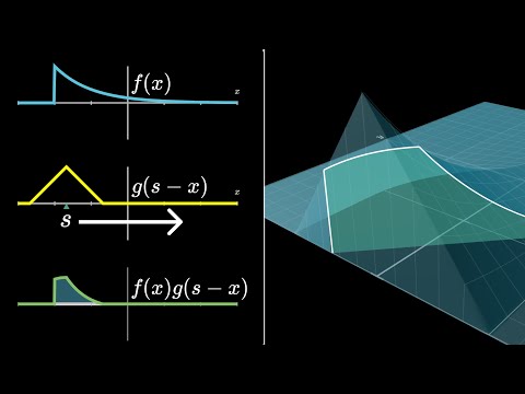
Now, the astute among you might notice a slightly weird quirk with the formula as it’s written. For example, if you plug in a given value like s = 4 four and you unpack the sum letting X range over all the possible values going from one up to six, then sometimes that corresponding Y value drops below the domain of what we’ve explicitly defined. For example, you plug in zero and negative one and negative two. It’s not actually that big a deal. Essentially you would just say all of these values are zero. So, all these later terms don’t get counted. It can seem intimidating to see the definition of a convolution in the continuous case, but if you think of it as an analogy to the discrete case, it’s easier to understand. In the continuous case, instead of a sum, we use an integral. The expression for the convolution between two random variables looks like the integral of a pair wise product of the density functions for each variable. For example, if we have two random variables with wedge and double lump shaped distributions, the integral would represent all possible pairs of values from negative infinity to infinity that are constrained to a given sum. So, as I slide S around, the shape of the product graph changes and so does the corresponding area. Keep in mind, for all three graphs on the left, the input is X and the number S is just a parameter. But for the final graph on the right, for the resulting convolution itself, this number S is the input to that function and the corresponding output is whatever the area of the lower left graph is.
For the demo, instead of graphing G directly, I want to graph G of S minus X. This has the effect of flipping the graph horizontally and shifting it either left or right depending on if S is positive or negative. As I shift around this value of S, the shape of the product graph changes and so does the corresponding area.
Keep in mind, for all three graphs on the left, the input is X and the number S is just a parameter. But for the final graph on the right, for the resulting convolution itself, this number S is the input to that function and the corresponding output is whatever the area of the lower left graph is.
For example, if each of our two random variables follows a uniform distribution between the values negative one half and positive one half, the product between the two graphs is one wherever the graphs overlap with each other and zero everywhere else. As I start to slide S to the right and the graphs overlap with each other, the area increases linearly until the graphs overlap entirely and it reaches a maximum.
And then after that point, it starts to decrease linearly again which means that the distribution for the sum takes on this kind of wedge shape. This is analogous to the sum of two unweighted dice, where probabilities increase until they max out at a seven and then they decrease back down again. This is a general feature of convolution.The convolution of two functions is the same as the product of their corresponding three dimensional surfaces.
Again, as I slide this around left and right and the area gets bigger and smaller, the result maxes out in the middle but tapers out to either side. Except this time it does so more smoothly. It’s literally a moving average of the top left graph. One thing you might think to do is take this even further. The way we started was combining two top hat functions and we got this wedge then we replaced the first function with that wedge and then when we took the convolution, we got this smoother shape describing a sum of three distinct uniform variables but we could just repeat. Swap that out for the top function and then convolve that with the flat rectangular function and whatever result we see should describe a sum of four uniformly distributed random variables.
Any of you who watched the video about the central limit theorem should know what to expect. As we repeat this process over and over, the shape looks more and more like a bell curve. Or to be more precise, at each iteration, we should rescale the X axis to make sure that the standard deviation is one because the dominant effect of this repeated convolution, the kind of repeated moving average process is to flatten out the function over time. So, in the limit, it just flattens out towards zero. But rescaling is a way of saying “yeah yeah yeah, I know that it gets flatter but the actual shape underlying it all?” The statement of the central limit theorem, one of the coolest facts from probability is that you could have started with essentially any distribution and this still would have been true. That as you take repeated convolutions like this representing bigger and bigger sums of a given random variable, then the distribution describing that sum which might start off looking very different from a normal distribution over time smooths out more and more until it gets arbitrarily close to a normal distribution. It’s as if a bell curve is in some loose manner of speaking the smoothest possible distribution and attractive fix point in the space of all possible functions as we apply this process of repeated smoothing through the convolution.
Naturally, you might wonder why normal distributions? Why dysfunction and not some other one? There’s a very good answer and I think the most fun way to show the answer is in the light of the last visualization that will show for convolutions. Remember how in the discreet case the first of our two visualizations involved forming this kind of multiplication table showing the probabilities for all possible outcomes and adding up along the diagonals. You’ve probably guessed it by now but our last step is to generalize this to the continuous case. And it is beautiful but you have to be a little bit careful. Pulling up the same two functions we had before, F of X and G of Y, what in this case would be analogous to the grid of possible pairs that we were looking at earlier? Well in this case, each of the variables can take on any real number. So we want to think about all possible pairs of real numbers and the XY plane comes to mind. Every point corresponds to a possible outcome when we sample from both distributions.
Now, the probability of any one of these outcomes, X Y or rather the probability density around that point will look like F of X times G of Y. Again, assuming that the two are independent. So a natural thing to do is to graph this function, F of X times G of Y as a two variable function. Which would give something that looks like a surface above the X Y plane. Notice in this example how if we look at it from one angle where we see the X values changing, it has the shape of our first graph. But if we look at it from another angle, emphasizing the change in the Y direction, it takes on the shape of our second graph. This is a general feature of convolution. The convolution of two functions is the same as the product of their corresponding three dimensional surfaces. But now that we have this geometric intuition, it’s actually a lot easier.You can just look at the graph and see what’s happening.
This three-dimensional graph encodes all the information we need. It shows all the probability densities for every possible outcome. If we want to limit our view to those outcomes where $X + Y$ is constrained to be a given sum, it looks like a diagonal slice of the graph. All the possible probability densities for this constrained outcome is like a slice under the graph, and changing the sum shifts the slice.
The way to combine all the probability densities along one of these slices is to interpret it as the area under the curve, which is a slice of the surface. This is almost correct, but there is a subtle detail regarding a factor of the square root of two. The areas of these slices give us the values of the convolution, and all the slices we look at are the same as the product graph we saw earlier.
It’s much more obvious that $F$ convolved with $G$ is the same thing as $G$ convolved with $F$, and the diagonal slices are not exactly the same shape. They are stretched out by a factor of the square root of two. This means that the outputs of the convolution are not quite the areas of the diagonal slices, but divided by a square root of two.
Now, we can use our geometric intuition to answer the quiz question about adding two normally distributed random variables. We just look at the graph and see what’s happening. In this case, the integral is not prohibitively difficult - there are analytical methods, but for this example, I want to show you a more fun method where the visualizations, specifically the diagonal slices, will play a much more prominent role in the proof itself. Many of you may actually enjoy taking a moment to predict how this will look for yourself. Think about what this 3D graph would look like in the case of two normal distributions and what properties that it has that you might be able to take advantage of. And it is for sure easiest if you start with the case where both distributions have the same standard deviation. Whenever you want the details and to see how the answer fits into the central limit theorem, come join me in the next video.